FOUR SEVEN
Contemporary jewellery for self-expression
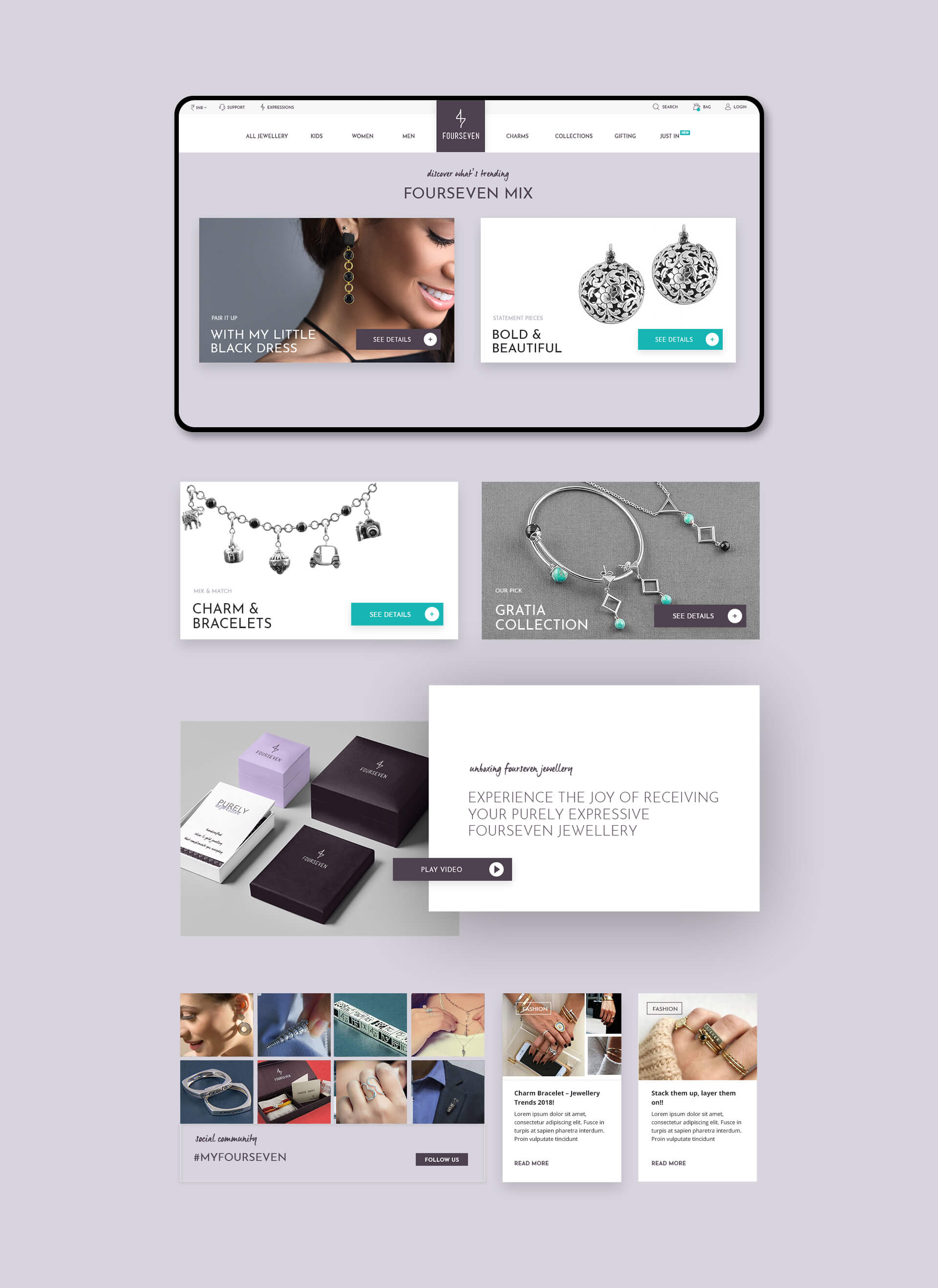
Wibe was chosen to redesign the UI of the Four Seven e-commerce store as they were migrating from Magento Community Edition to the Enterprise Edition. While design thinking we focussed on three elements - Improving the mobile & web usability to aid conversions, making the product discovery easy and enhancing the visual appeal of the store.
The navigation was completely changed and a detailed fat menus introduced to aid product discovery. New features like style galleries and 'Four Seven Expressions' were introduced. The checkout flow was changed to a single click checkout with emphasis on discounts and deals.
We wanted the user to feel that the brand is luxurious yet affordable. So while designing the UI we used a grey & purple theme with combination of serif & sans-serif typography. What emerged was a visual style that was modern, expressive and aspirational.
Digital Communication Design
High Fidelity Wireframes
Responsive UI Design
Design System


